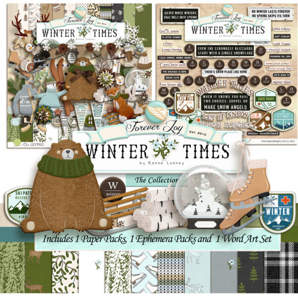
Seeing your designs come to life in a layout is an amazing feeling! I am always happy with the way a final design comes together (I mean, if I wasn’t I wouldn’t offer it to you lol!) – but when you see it used in story telling and pair with photos- it’s like the design gets a heart- and it get a whole new layer of meaning.
I always work to be sure my designs can be used in a way to push pause and capture the simple good stuff and that ‘crating joy” is more than just a tagline- and to be honest- I am never really sure that happens until I see the products come to life in your layouts!
I wanted to share just a few of the FJ Creative Team layouts here with you-
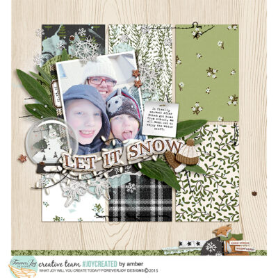
Look how many papers @Amber packed into this page while keeping it feeling light and airy! The grid layout with spacing between- the light delicate background paper and the bright photo are all to thank for that! Composition is key!
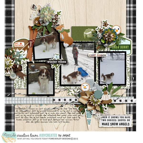
Here’s another look at the same background paper- but this time there are several photos used in the page. @jetjeZ made the photos pop using a black frame! It plays perfectly with the plaid paper and gets you focus in on the photos.
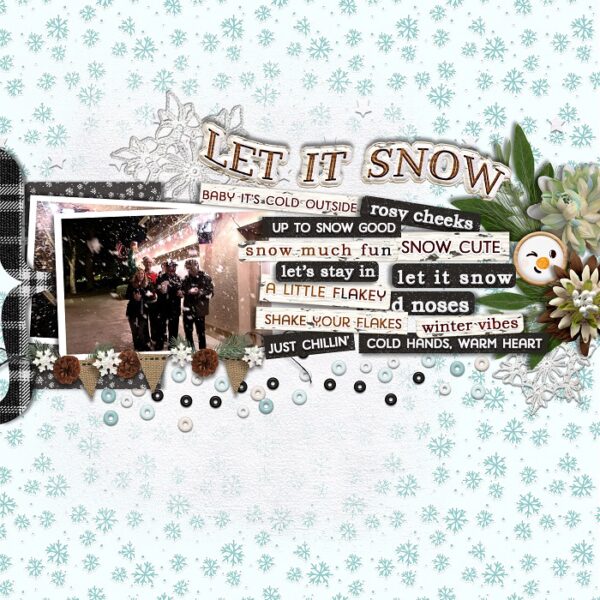
Word Art to the rescue! This layout by @Trishdoesn’t have a single word of text- and it didn’t need too! She used her Word Art to title and journal and did it in such a way that the words themselves became elements! It’s such a fun feel!
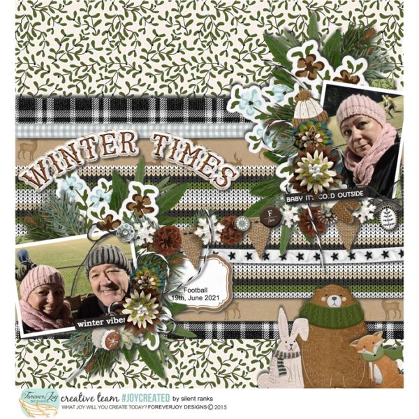
Layering for the Win! I love how the winter layers in the photos mirror all the layers on the page- the textures and cozy clusters just carry through the theme of bundling up and staying cozy! It’s a very effective composition by @silent_ranks!
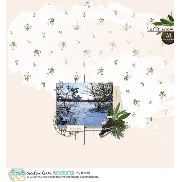
One of the reasons this page seems so delicate is the soft blending of the dainty floral paper and sizing down of the ellies paired with the bright creamy colors carried throughout. It’s very effective composition and makes for a great layout by @Katell
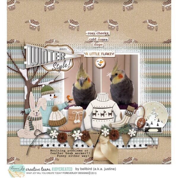
The perfect combination of ellies, word art and humor make the magic of this page! That paired with a strong horizonal line created with the space between the photos the centering of the word art strips and a large centered ellie (the knit sweater) makes this layout by @bellbird work so well!
Have you learned any tricks from these examples? I know always learn something new when I look closer at the layouts in the gallery- sometimes you don’t even realize the magic behind the composition until you look a little closer. I hope these examples help you see that and inspire you to craft you own joy as well!
xo
renne
