 It’s a memory from high school that is clear as day- Sister Cecilia is handing back our essays for rewrite- marked in red pen- exclamation marks and circled spelling and her notes if the margins while she drilled into us:
good, better, best, never let it rest- ’till the good gets better and the better gets best!”
Perhaps I have to thank (blame?) her for my perfectionism and my drive to always work just a little harder to make things a little better. Let me share with you how this has translated into the 12×12 squares of my memory keeping:
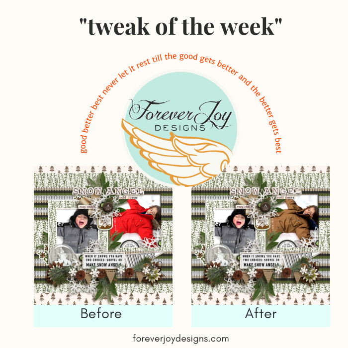
I was working with this layout the other night-

I was thrilled to have the two similar photos of my boys taken about 7 years apart- and I really wanted to tell the stories of how these two love the cold- so, story telling wise- I was happy.
I sat back in my chair and looked at my screen. Sometimes squinting helps. I like to think I have clearer vision that way- a scrappers superpower. *lol*
I looked the layout over. I liked it- but just didn’t love it. It could be better- just- how?
The colors! The red coat was a nice contrast to the green and the grey coat was a nice match- but the two were working against each other. Either both should contrast- or both should match. There needed to be a better harmony of colors-
First, I tried to desaturate both photos and make them black and white-

I liked the black and white photo layout better- but felt like the photos lost a little bit of their energy.
Better, but not best.
I decided to try recoloring the red coat. Ctrl-Alt-Z to the rescue.
Life should come with a Ctrl-Alt-Z
Red is one of the easiest colors to manipulate in Photoshop- so I started to play around:
- I selected the red coat carefully with my selection tool
- and opened the Hue-Saturation slider set to “reds”-
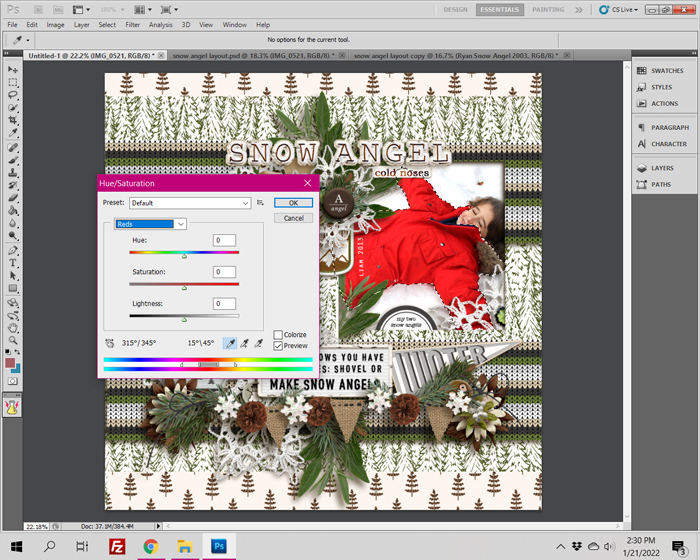
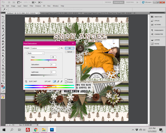
I played around with the yellow and toned it down to a brown to harmonize better with the grey coat. Then I tidied up the horizontal line that could be drawn from the top of the page title down- and this was the result

What do you think? Did you prefer one layout over the other? Drop a comment below and let me know!




LOL Michele! YES! That is true about running the risk of distorting reality to much! Red was a huge color for the boys and they NEVER would have chosen brown LOL! Black and white is less a disturbance of reality- That may be the better way to go! 🙂
Renee – Love the LO! The idea that “both should contrast or both should match” – I need to write that one down. I think *I* would have gone for the b/w option, and here’s why.
I’m old school – my 22yo daughter’s baby photos are, actually, photos with negatives. Yes, I’ve scanned them, but I also have a limited amount of them because of the era. And with my own baby photos, it’s worse (I have a miniscule number of them at all). To me, changing a photo to b/w is less a “tweaking of reality” than changing it from bright red to brown. In the overall scheme of things it doesn’t matter and for a designer using her LOs to showcase her product, it matters less. It’s just a line I’ve drawn in the sand for myself, to keep my work true to our life, not to my need for a better LO.
ALL that said, your recolored coat does do a lot of nice things for the overall LO. Maybe sons don’t say to you, “I don’t remember a brown coat?” I can promise, daughter’s do. LOL!