It’s late February, which is mid winter here in NYC- and truth be told, it’s probably my least favorite time of the year. The warm Spring sun seems so far away and there are piles of soot stained snow everywhere. I do my best to decorate for Valentines day and St. Paddys, and maybe it’s just because I have been ODing on HGTV, but the house just feels bare and in need of some serious make over magic.
There’s a saying I love that goes: “If you want the light to come into your life, you need to stand where it is shining.” And sometimes, especially during days like these when there ain’t no light shining no where- you just have to shine some yourself. Attitude adjustment. It’s the only way that ever works for me to get out of a funk. I need to do deliberate attitude adjustment and look real hard for- or just roll up my sleeves and turn on the happy shine in my days.
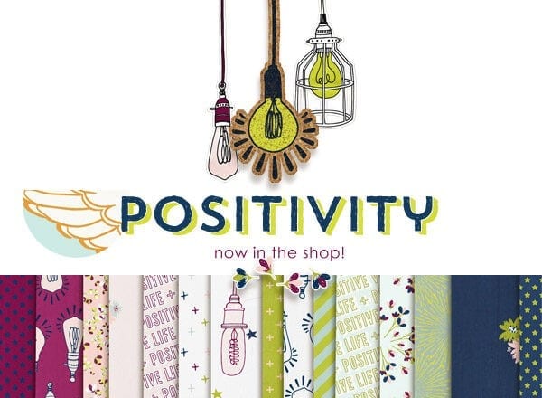
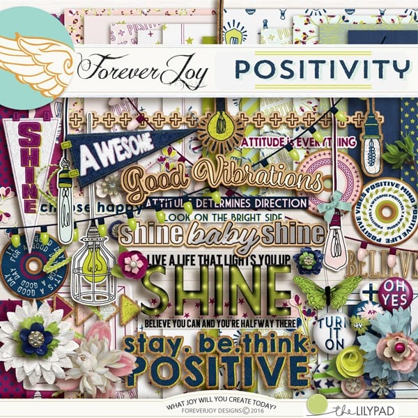
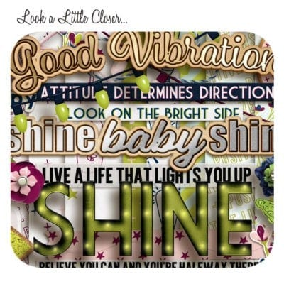
That mind shift is what inspired my latest digital scrapbooking design, POSITIVITY. Edison styled light bulbs, clean crisp lines, bright marquee light and pops of line green just seem to make the whole thing shine!
Here are a few Creative Team layouts -I like to call #joycreated – using the design:
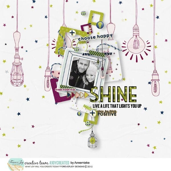
I love the off set frame and ellies here- that add a real sense of movement and energy- and the use of a black and white photo int the middle of bright colors. When I have a photo I’d love to use that just doesn’t match my supplies, my go to trick is to change it to black and white.
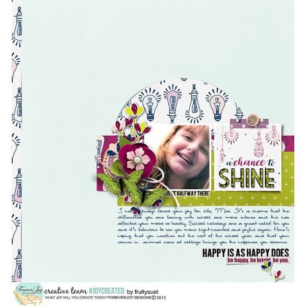
I love the peek through papers here. It’s a great way to incorporate busy patterns into a layout- and cut outs are a fresh alternative to simply layering papers. I wonder if this page would feel as modern as it does if the strip on the side and circle pattern were layered on top of the blue paper, as opposed to being cut out? I also like the close up photo. many time, when my layout is story based, as opposed to event based, I like to zoom in on one aspect the of the photo. This selective cropping is also a great way to use one fave photo in a few different layouts.
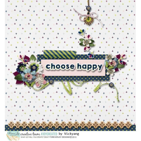
Here is a great example of a non-photo layouts. I like to make layouts like this as screen savers and planner inserts. There is no pressure to find or edit the perfect picture and they can be so inspirational!
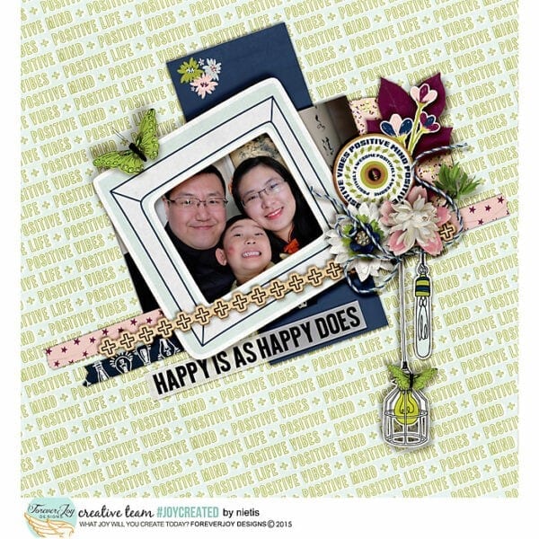
and finally- here are two more great examples on how angles can add interest, energy and movements- and how bold matting can make patterns easier to use on a large scale.
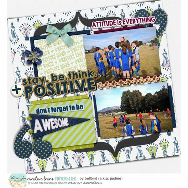
There are more layouts using this design in the shop here- and if you have any layouts you would like to share with me, share them in my gallery at the Lilypad or tag me on Instagram or Facebook- and if you use #joycreated , you just may be featured as a gallery standout!
