Shadowing is, in my opinion, the secret sauce of a great digital scrapbooking layout. A page with no shadowing just looks wrong- a page with shadows that are too dark also misses the mark. So- how to you find that Goldilocks sweet spot that makes your pages shine? That is the Holy Grail we are all in search of my friend- and I think it’s a process we each perfect one layout at a time.
How you go about adding shadowing to your digiscrap layouts depends greatly on the program you are using. The sliders, adjustments and dialog boxes vary from one program to another- but trust me- there is a tutorial for everyone on YouTube! I absolutely recommend doing a little search of your program for a video to add a few tricks to your arsenal. My Creative team has shared some of their shadowing tricks on the blog over the years- you can check them out here.
In my opinion, there are a few universal rules of shadowing apply across programs:
- Shadow everything (almost) – unless it’s text- it should have a drop shadow. Alpha’s made of chipboard or rubber any other material need a shadow.
- Make sure all your shadows come from the generally the same direction. As you go down or across a layout, the angle of your shadow may change a tiny bit- but for the most part- the angles are generally uniform.
- Vary the depth, distance and strength of your shadows. A flower will have a deeper shadow than a piece of paper, and the paper will have a darker shadow than a ribbon.
Hack: Try starting with a commercial style and then play with it to make it your own.
I use Photoshop CS and it allows me to create a separate layer for my shadows. Once I do that, I use warp and puppet tool to play around and make them more realistic. Sometimes I lighten this layer and then add another shadow layer to the element for a little depth.
- Another often overlooked trick is to play with the actual color of the shadow. yep. just going from black to grey can give dramatically different results. Check out this example:
Here- the shadow color is the default black
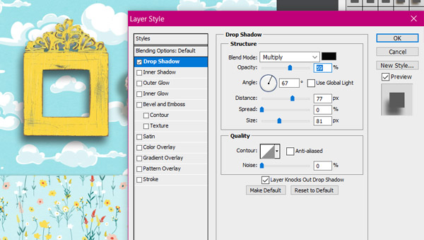
and here- it’s changed to a lighter grey
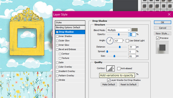
Play around! Have fun and see if changing the colors of your shadows gives you the result you are looking for!
- Lot’s of scrappers swear by using “linear burn” instead of “multiply”– you may want to give that a try! Remember- we have the amazing superpower of “undo” so feel free to play around.
Pro tip 1. When you create your next layout- and are really happy with the result- why not make a copy of it before you flatten it? Then- go a little crazy tweaking angles and distance and deepening your shadowing opacity. Then- compare the two! You may just find you have added a few new tricks to your bag!
Pro tip 2: Love the shadow you created on a certain flower or button or photo? Save that as a style of your own so you can replicate it again with the click of your mouse!
Here’s a quick look at a before and after page by Joymaker Amber who constantly rocks layouts on my creative team! You may know her as @sm_Amber at the Lilypad.

“I often find my pages don’t feel quite finished when I’m “finished”.. Answer: reduce your background 97% and stack some papers behind it off kilter. Sometimes I’ll also throw in additional ribbons, paper tears, string, etc between the layers to give it a bit more depth and detail.”
Before Shadow Play

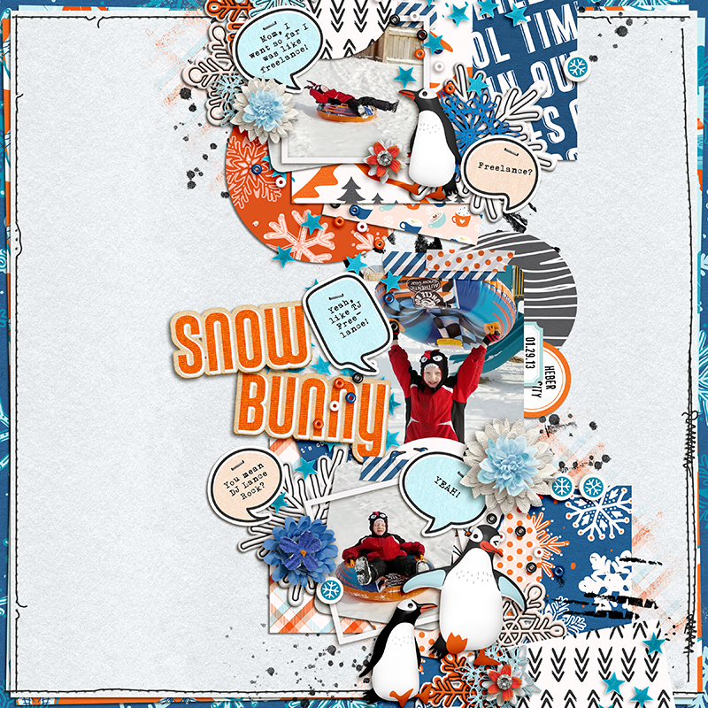
After Shadow Play
Hope these tips gave you a little inspiration and incentive to play with your shadows! And if you have any tricks or lessons you’ve learned – leave a comment below!
