A forever ago, when there were tons of scrapbooking magazines to choose from each month, one of most popular features were the “page maps”. Visual templates you could follow and scraplift to put your layouts together. I guess you could call them the kissing cousin to today’s digital layout templates.
But truth told- even though I loved looking through these maps- I could never really translate them to my own work. It just seemed to difficult and the fun got lost in following the rules.
Instead- I really enjoyed learning as much as I could about design principles in general. The “why” behind a great looking page. That was something I could embrace and follow time and time again.
So, I thought I would share a few lessons I have learned along the way to help jump start and amp up your own layouts. It doesn’t matter if they are digital or paper- these design theories apply across the board.
One of my favorite- go-to design hacks is to put everything on a shelf. In other words, using a horizontal element to anchor your page and it’s elements.
Using a shelf gives the eye a focus, and helps create strong balance. It prevents your elements from floating around- which translates to the eye darting around the page in a way that subconsciously makes you feel like something is off. Shelving is just one of many tricks to make a scrapbooking layout work- but it’s an easy to apply and no-fail way to pull a page together.
A “shelf” can be a horizontal element, like a strip of paper, a custer of elements that provide a sturdy horizon base, a piece of Word Art, or even journaling. Take a look at these examples:
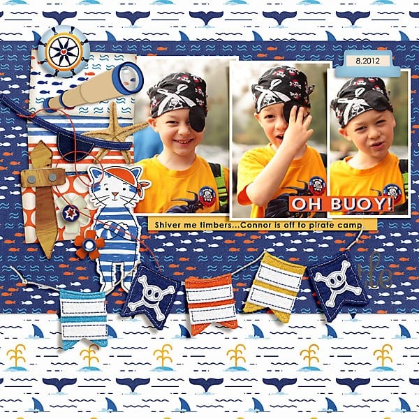
The yellow paper with journaling provides a shelf that the photos and ellies rest on- and gives pleasing support to the banner below. (supplies: First Mate page kit)
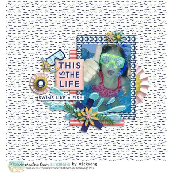
In this layout- it would be very easy for the page to become busy in the patterns of paper. But a strong element like the splash of water anchors the photo, supports the other elements and helps bring focus to page. (supplies: Poolside page kit)
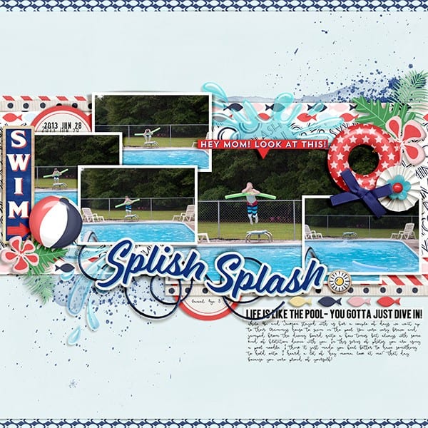
A strong piece of Word Art or a title also works well as a shelf. Here, the curve of the shelf also adds a nice flow- and is given extra support by the fish elements and the vellum word art beneath it. It’s a strong base, and keeps the eye moving across the page in a pleasing way. (supplies: Poolside page kit)
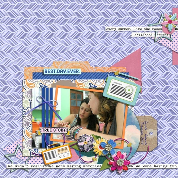
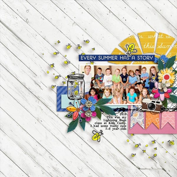
Here, a strip of solid journaling at the bottom of the page not only prices a great shelf, but also gives the eye a resting place in mix of patterns. (supplies : Summer Stories page kit)
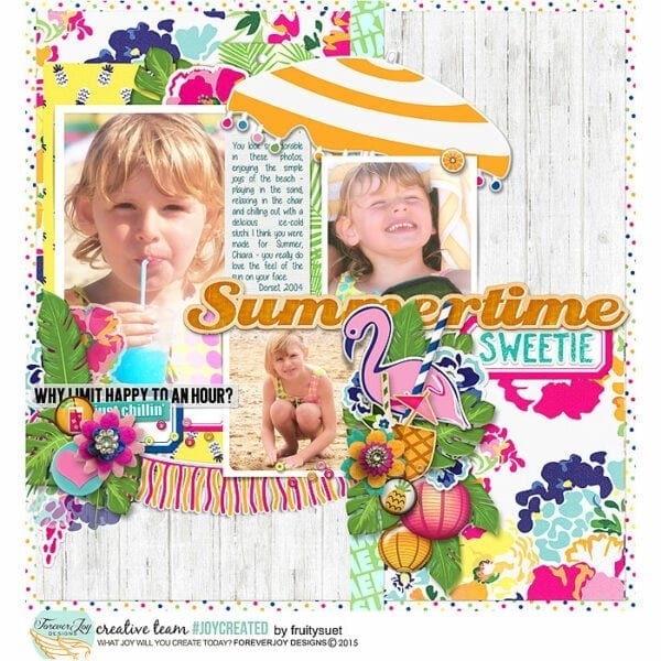
A great way to ensure balance when you have a lot you want to add to a page is to use your shelf to hold things in place both above and below it. In this layout, the “summertime” Word Art not only supports the main photos above it- it anchors the element cluster and smaller photo below it. Without this horizontal break, the page would not feel as balanced and the eye would not have a solid flow to follow. (supplies: Pina Colada page kit )
Here is another example of “over/under shelf support” (supplies Poolside page kit)
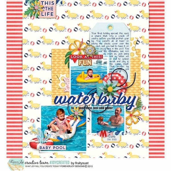
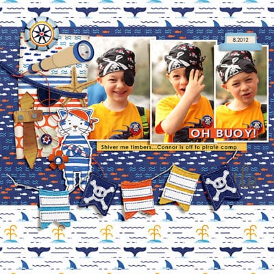
Using a shelf doesn’t mean you have to keep your layout centered. In this layout, the photo and cluster is placed on the right side following the flow on the patterned background paper. This trick brings the eye directly to where the action is. Then, the journaling, stitching and banners provide the shelf that gives the page terrific focus. (supplies: Summer Stories page kit)
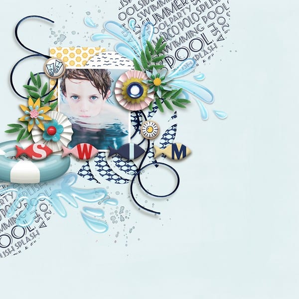
Here, the layout is on the left and the shelf is the line of fish- the flow and support make this page a stunner! (supplies Poolside page kit)
What are your thoughts? Is the “shelf” design trick one of your favorites? I’ll be sharing more design hacks over the next few weeks- if you find them helpful and use any in your layouts- I’d love to know!
Thanks Justine! 🙂
LOL! I see what you did there! 🙂
Interesting perspective on that! =)
Awesome hack! Never thought about the ‘shelf’ idea but it’s so true! Great post – love all the pages with explanations!