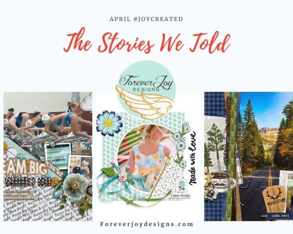
April’s drawing board was filled with stories of childhood wonder and imagination, the promise of growing through what you go through and the joy of crafting.
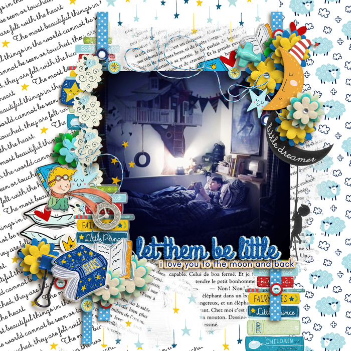
the joy of childhood imagination | mon petit
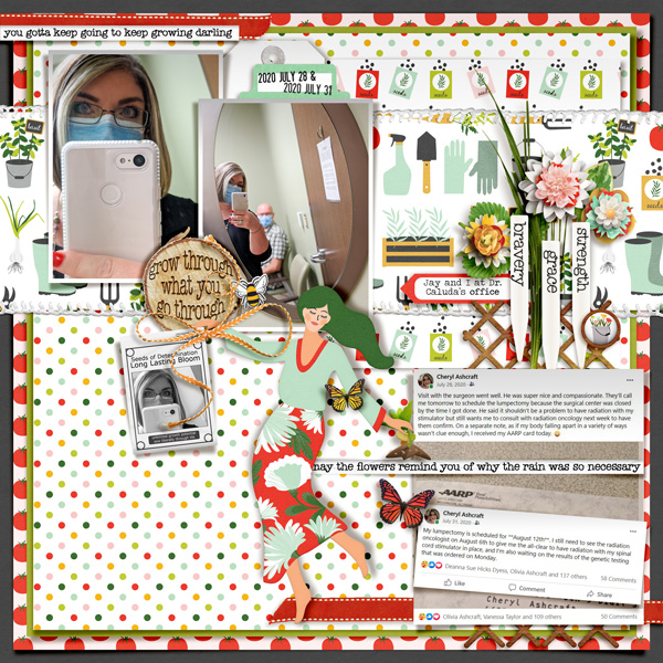
the joy of growth | Grow Through It
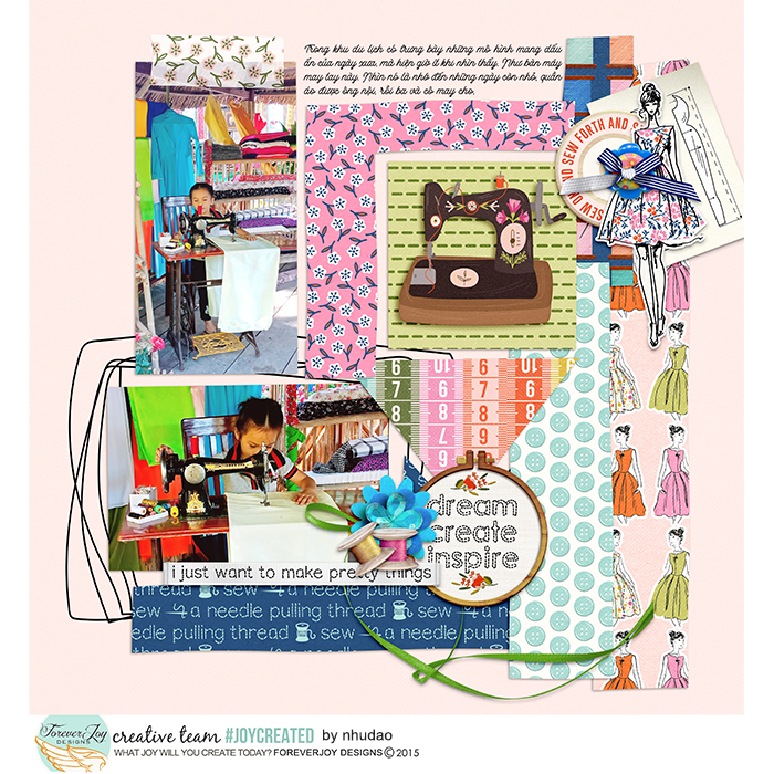
the joy of crafting | Sew Pretty Collection
“We are made of stories”
The ForeverJoy gallery was filled with so many creative layouts this month- and there are stories I’d love to spotlight; their composition and message made me stop for a moment and smile. I hope they do the same for you.
How awesome is the overlay effect here? It spotlights the sweet photo and gives a dreamy feel to the page-
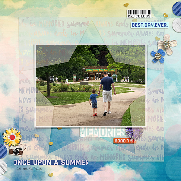
The colors and patterns here are mixed perfectly- and the closeup photo is highlighted with a mat and pretty element clusters- the page has a terrific flow and focus!
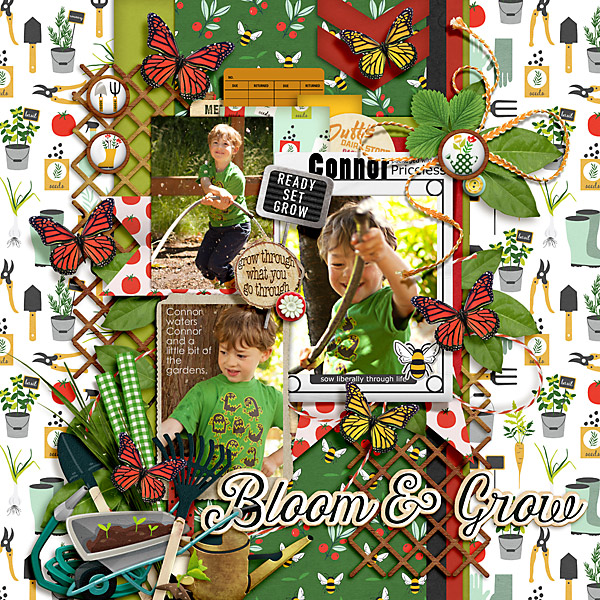
Love how the deep background plays so well with the patterns – and the cluster of elements adds to the story of the page. The details on the bottom of the page help ground it perfectly!
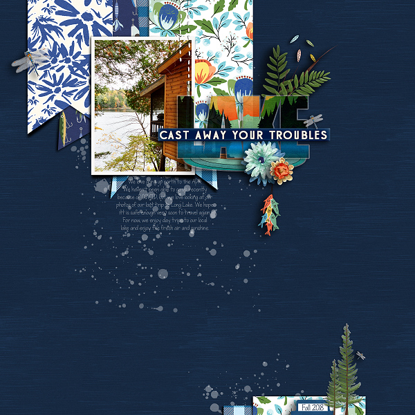
This page has awesome movement and energy- and the colors are paired perfectly! The tucking of photos and papers are shadowed so realistically!
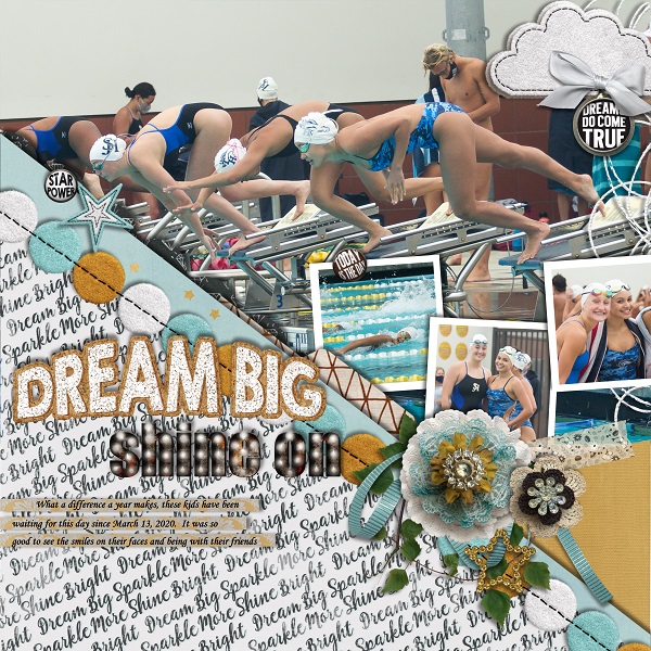
I love the play of colors here and the photos are just amazing- they show the care and magic of falling into a crafting project. I think it’s fair to say- we’ve all been here.
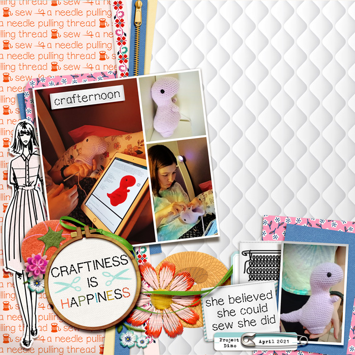
I love the humor in this page! Teen parent Zone is still one of my fave designs because it never fails to crack me up! The composition and journaling here make the page a winner!
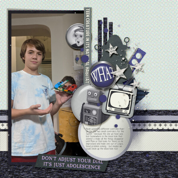
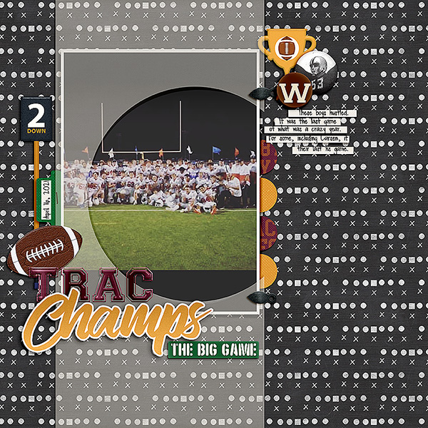
A football page is always going to win my heart! I love how the overlay helps draw focus and how the dark paper plays so well with the photo!
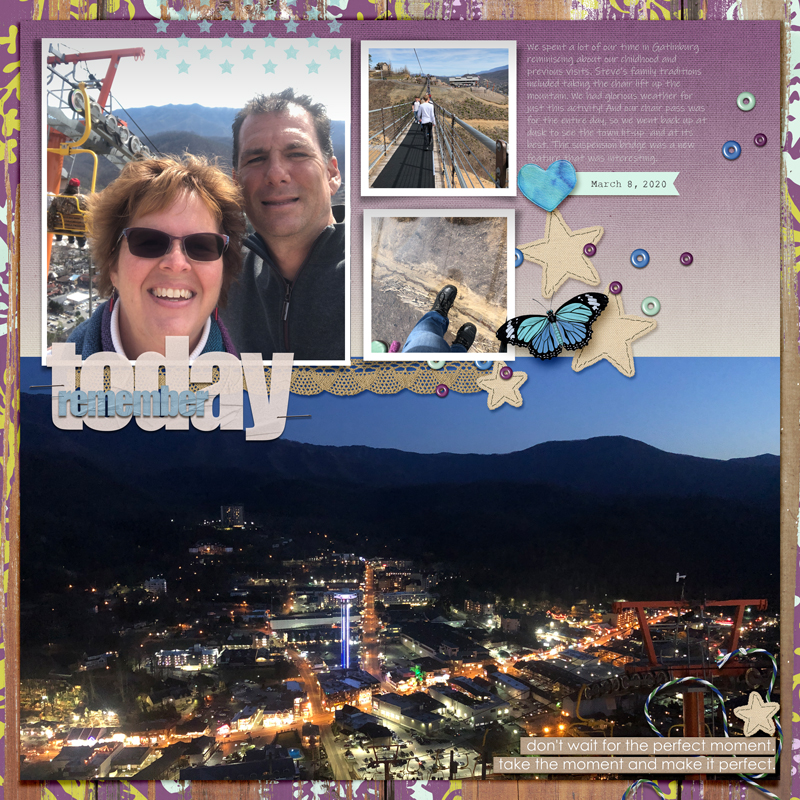
The title on this page is done so well and I love the color and size choices! Without even reading the journaling- you can tell this was a special adventure!
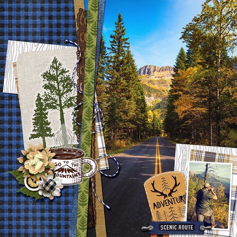
This page was a show stopper for me! The layering and angles give the page movement and contrast so nicely with the tall trees and the main photo is just a-mazing! This is the story Wild At Heart was designed for!
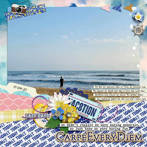
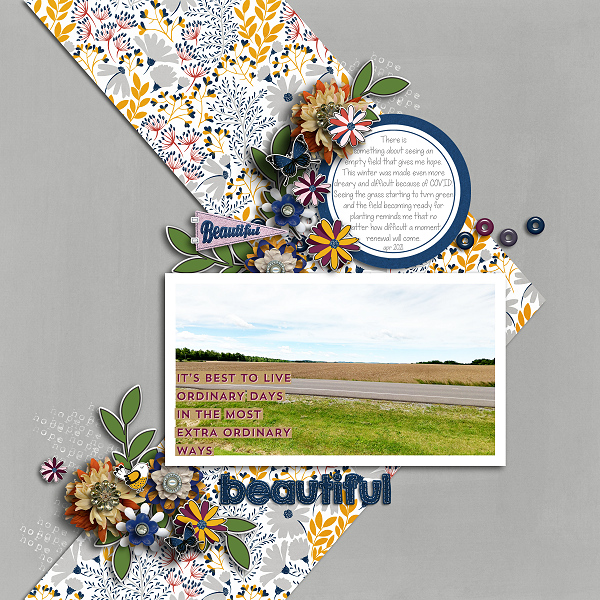
The play of colors here and chevron design anchoring the photo framed with ephemera is just perfection! All I can say is that I simply love this layout.
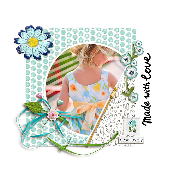
The simplicity of this layouts is it’s beauty. The circle photo framed with just a hint of white space, the repetition of blues and florals and the delicate little bow make for a beautiful page.
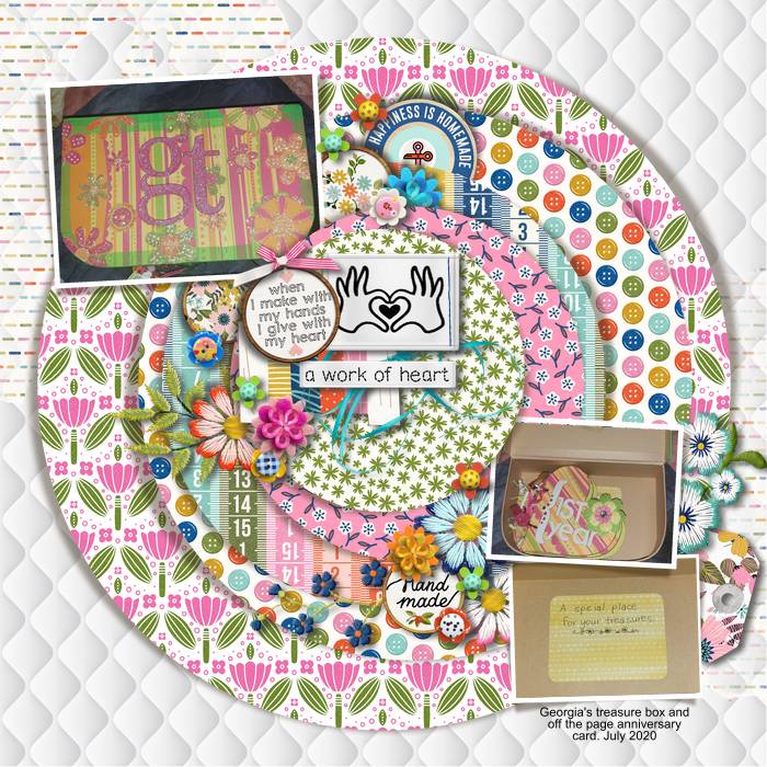
I love the layers and layers of patterns and tucks of little pretties in each fold- it’s a beautiful page with terrific balance of colors.
This page is just stunning! The big photo is anchored perfectly with angles and tucks of elements and the colors play off each other perfectly. Love it!
