Each season has it’s own tried and true classic hues- and that can be a great thing! It’s a visual nudge we collectively embrace to change gears settle into a bookmarked time of year. Pastels? Spring! Red and green? Christmas! And right now- it’s Autumn- which brings with it’s own warm and cozy palette of colors. But sometimes- when you turn to the same colors, year after year of storytelling- your layouts and creative process can feel a bit stale. The solution? Mix things up a bit! Add some unexpected colors to the classics!
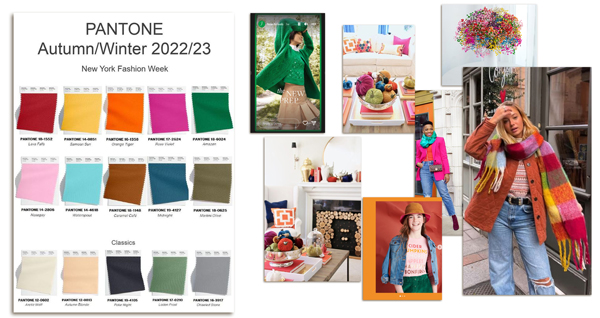
On trend this Autumn are classic colors mixed with pops of vibrant happy hues! That’s what Pantone has declared for 2022. A quick look on Pinterest demonstrates how that’s been translated:

As for me- I am a huge fan of mixing pops of color with the Classics. Mixing some happy unexpected pops of colors is a terrific way to keep your seasonal pages fresh and varied. I mean, wouldn’t your albums get boring if every autumn layout was cranberry, rust gold and brown and every Halloween layout was orange and black? Pops of color can add an additional layer of vibe to your pages!
Here’s a look at how this Happy Hue trend has been translated in some Autumn #joycreated!
So- if you find yourself in a bit of a rut with your seasonal supplies- try mixing in a bit of unexpected color! If your supplies don’t have to colors your looking for- try recoloring things on your own in your editing program (hello Hue and saturation slider!) or even pulling from kits from other seasons! Your pages with look fresh and your albums will look the shake up!


